
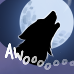
Pawb.social is well on it’s way to making an icon in the bottom left, anybody got some ideas for what we could do? Maybe a pixel version of our yeen, or something more suggestive?
You must log in or # to comment.
something more suggestive
Hey, @Jimbo@yiffit.net - if you’re still in the mood to place some pixels, want to add a tube of lipstick and/or a knotted rope over there somewhere? :3
Sure, there’s a little space left around the icon, perhaps a small knotted rope diagonally between the yiffit.net text and the kiwi lazer?
I like it!
I’m not sure where to start with this one, if you have any design in mind let me know :3
🪢
How to pixel art knot
If we go with the knot emoji idea, there’s this one:

In fact, we can fit both emoji in that spot:
Maybe putting a black background the knot would make it pop more.
Oh yeah I see! Pops okay on white to my eye. I’ll be sure to place some pixels uwu
Its interesting the different renders for unicode. To me the unicode rope is a slanted to the right blue figure 8 with a slightly wavy line through the middle.
I mean, if there is enough people, sure. But it might just be better to help pawb out. BTW the name “Amne” won my poll for our Yeen’s name. !meta@yiffit.net
ah, I knew there was a name for our yeen somewhere! Pawb.social seems to be just fine at the moment, I suspect they’ll be done early based on their progress, assuming they don’t have to defend their space much.
Here is the template of the icon above pawb.social:
Would it make more sense to have a uniform medium brown with a black nose and white eye?
As in brown (highlighted) rather than chocolate?
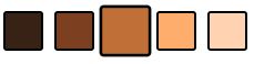
Testing out the colours and I’d probably say that’s closest
At a glance I think that looks better.
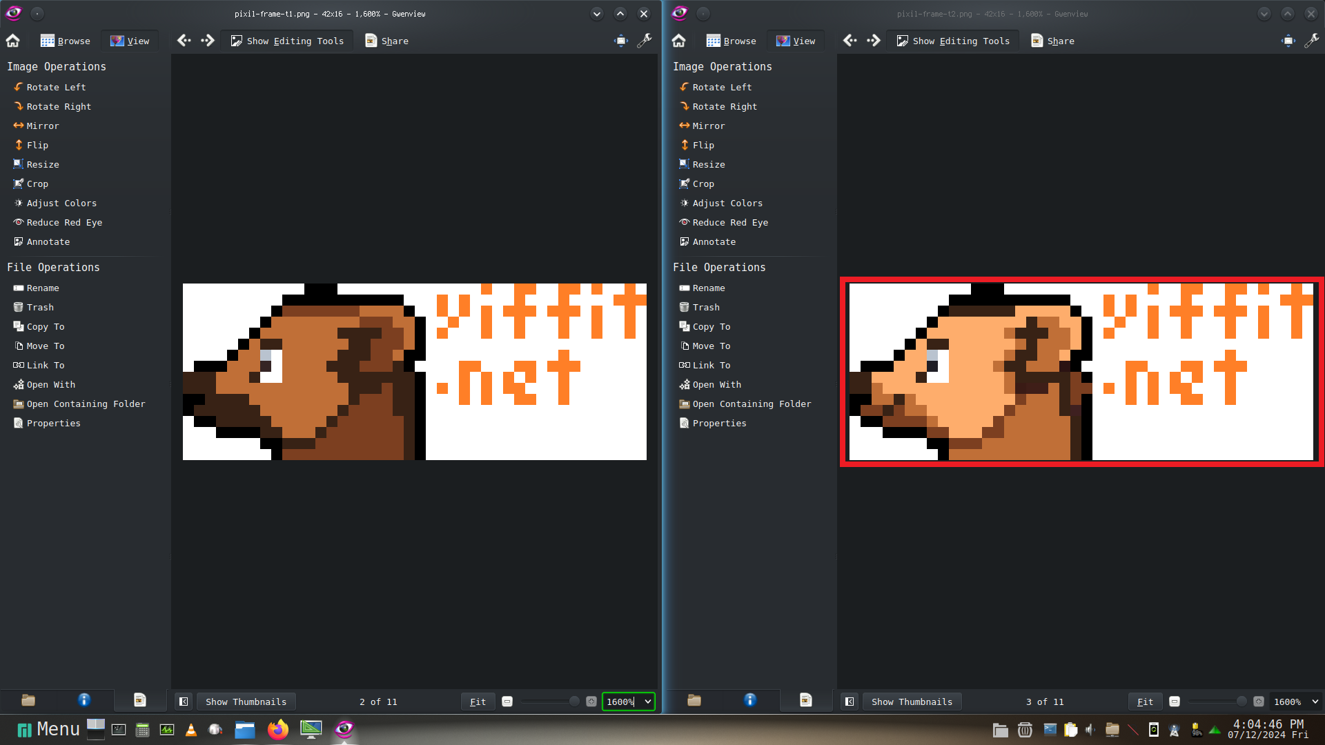
I think we have a design sorted colours and all on the right:
using peach as the main colour /u/user224@lemmy.sdf.org ?
You can probably keep the highlight on the ear. Use whats currently done as a baseline. The template should be updated though.
Template has been updated <3
