- cross-posted to:
- gnome@discuss.tchncs.de
- theandrocollection@lemm.ee
- cross-posted to:
- gnome@discuss.tchncs.de
- theandrocollection@lemm.ee
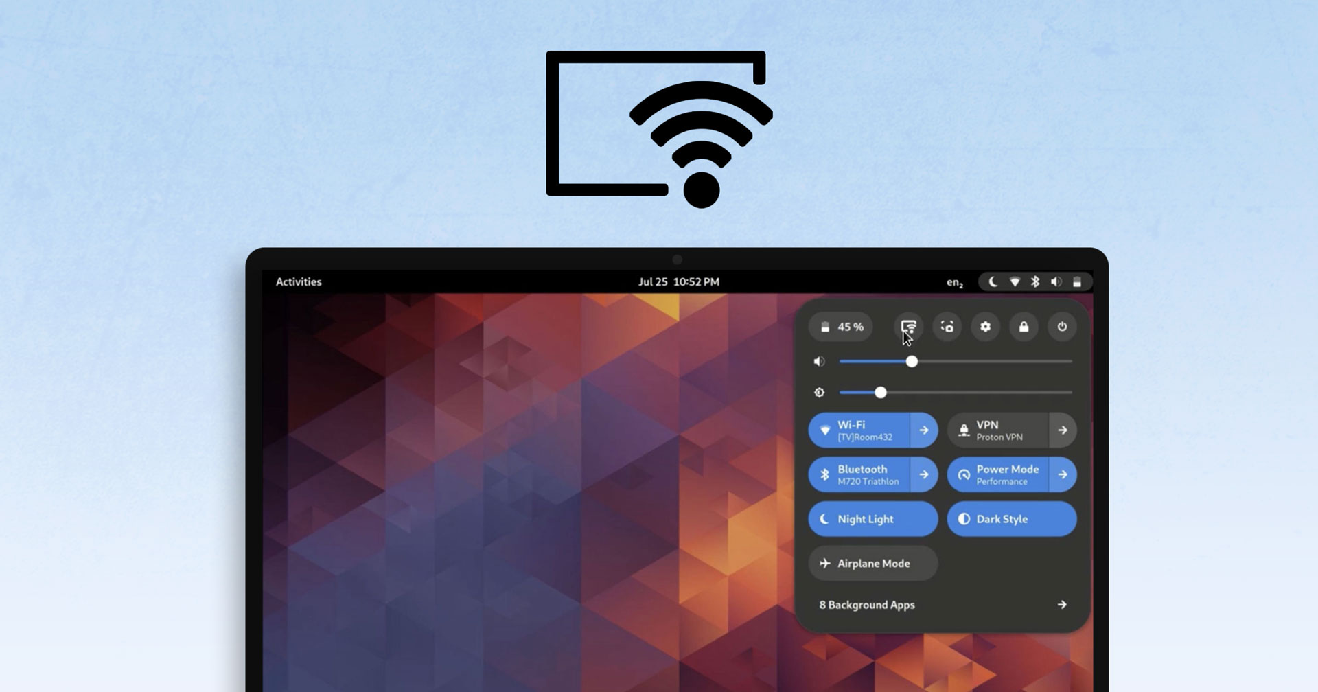
The developer working on integrating network display functionality into GNOME Shell shared short video clip to the GNOME sub-reddit […] the feature adds a “screencast” button to the row of actions in the Quick Settings menu. Clicking this opens a modal picker where the user can select any Miracast or Chromecast compatible displays on the network.


I really like gnome but those giant buttons doesn’t look good.
Just sharing a recent positive experience with bigger buttons: I just did some remote support because a printer wouldn’t work. RustDesk worked great and thanks to the bigger buttons clicking them with awful latency wasn’t so bad.
Yeah I guess they are practical and easier to push. There is always pros and cons. :)
Removed by mod
My nitpick with those menus is how close the pop up menu is to the top panel and right edge of screen. I’d love to see some space between there.