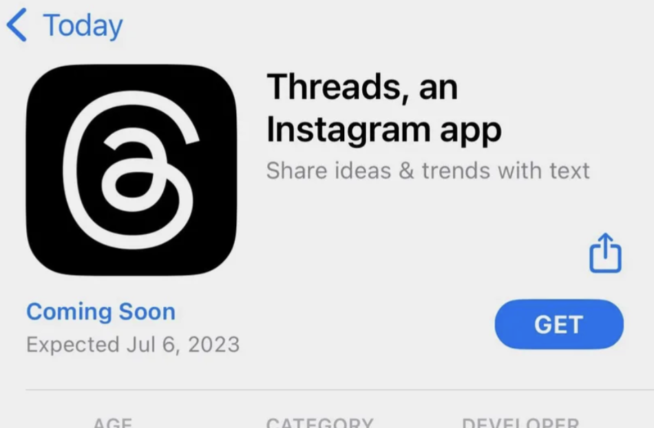
lol, looks like they just ripped offused the ol’ @ symbol, used a two-story ‘a’, made the loop go the other way around, and simplified to a curvy line… really curious how much they spent to come up with this. could have at least used the letter ‘t’ or something. or their little infinity symbol…
totally agree there’s unintended images I see in this.
lol, looks like they just
ripped offused the ol’ @ symbol, used a two-story ‘a’, made the loop go the other way around, and simplified to a curvy line… really curious how much they spent to come up with this. could have at least used the letter ‘t’ or something. or their little infinity symbol… totally agree there’s unintended images I see in this.edit: commenter is correct, thank you
My first though was oh look email for dyslexics!
It’s not “ripped off” when that’s exactly what it’s meant to be
I’m confused how it relates really it has no resemblance to the name or brand, kind of to mentions I guess??? It looks terrible