
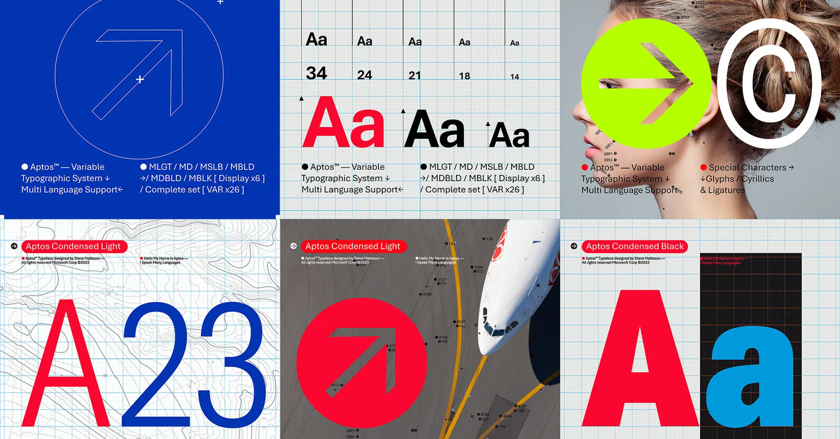
It’s the first change to the Office default font in more than 15 years.
You must log in or # to comment.
I don’t hate it?
It’s very inoffensive. That’s definitely what they were going for but that also means there’s not much to say about it.
Same
It’s like a Calibri-fied version of Trebuchet. You can actually tell the difference between I and l without changing the font to check. It’s an improvement.
Haha kbin’s font makes those entirely identical.
I’ll be long past my last round-up before I give up my comic sans
A man of culture
I don’t know how to explain why, but this article reads like garbage. Not in an AI way though.
Calibri is so widely used that it even became a key piece of evidence in a corruption investigation surrounding Pakistan’s prime minister in 2017.
What?! Fascinating. I’ll just click the link and… Oh.
I never really liked Calibri at any font size above like 14 pt maybe? Hopefully this new one is better than Arial and I can switch all my PowerPoints over to it.
I’m more of a Product Sans guy myself, but whatever floats your boat.
How to get this font on linux?
I will resist this change with all my might.
Because change? Or is there something about the font you strongly dislike?
You must do, what must be done.
I love it! (I don’t but I wanted to provide a 3rd contrasting viewpoint)
Is it just me or does it look quite condensed in the examples
Was called Bierstadt during preview. I’m relieved to see the curve of “l”. (Well, you possibly can’t decide if I’m talking about an L or 1 or i. That’s because Helvetica is a joke when it comes to distinguishability.)
What’s the old font?
As the 5th word in the Article tells us. It was Calibri.
It amuses me that this comment takes more words to get to the answer than the original article did.
I genuinely didn’t realize it was an article not just a post saying so. 🤦♂️ Thanks for enlightening me!!