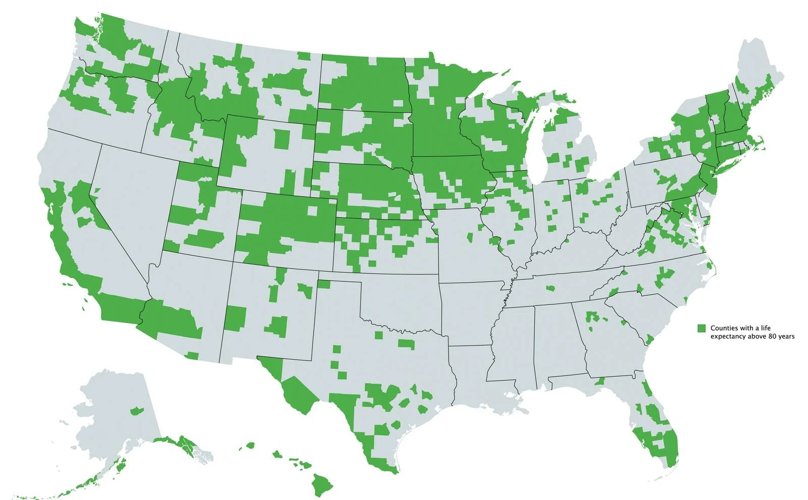
The Picard Maneuver@lemmy.world to Data is Beautiful@lemmy.worldEnglish · 2 years agoUS counties with a life expectancy above 80 yearslemmy.worldimagemessage-square36fedilinkarrow-up1162
arrow-up1162imageUS counties with a life expectancy above 80 yearslemmy.worldThe Picard Maneuver@lemmy.world to Data is Beautiful@lemmy.worldEnglish · 2 years agomessage-square36fedilink
minus-squareBurn_The_Right@lemmy.worldlinkfedilinkEnglisharrow-up8·2 years agoWe could just swap that green for blue.
minus-squaretiredofsametab@fedia.iolinkfedilinkarrow-up7·2 years agoNot really, at least looking at some of Ohio. Cincy seems to be missing, and I’m not sure which county that is in SE Ohio near the WV border.
minus-squareMinorLaceration@lemmy.worldlinkfedilinkEnglisharrow-up4·2 years agoNah, I’m thinking it’s probably correlated with wealth. I see a lot of red areas covered on this map
minus-squareJimmycakes@lemmy.worldlinkfedilinkEnglisharrow-up2·2 years agoBut your map contradicts what you’re saying??

We could just swap that green for blue.
Not really, at least looking at some of Ohio. Cincy seems to be missing, and I’m not sure which county that is in SE Ohio near the WV border.
Nah, I’m thinking it’s probably correlated with wealth. I see a lot of red areas covered on this map
But your map contradicts what you’re saying??