Gregor@gregtech.eu to Memes@lemmy.ml · 2 years agoI hate these iconsgregtech.euimagemessage-square153fedilinkarrow-up11.59K
arrow-up11.59KimageI hate these iconsgregtech.euGregor@gregtech.eu to Memes@lemmy.ml · 2 years agomessage-square153fedilink
minus-squareEphera@lemmy.mllinkfedilinkarrow-up8·2 years agoI think what really bothers me about the aesthetics is that the shapes are broken up by the coloration. For example, the pin icon for Google Maps looks almost like a hook, because the yellow has little contrast on this white background.

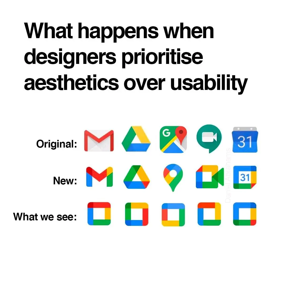
I think what really bothers me about the aesthetics is that the shapes are broken up by the coloration. For example, the pin icon for Google Maps looks almost like a hook, because the yellow has little contrast on this white background.