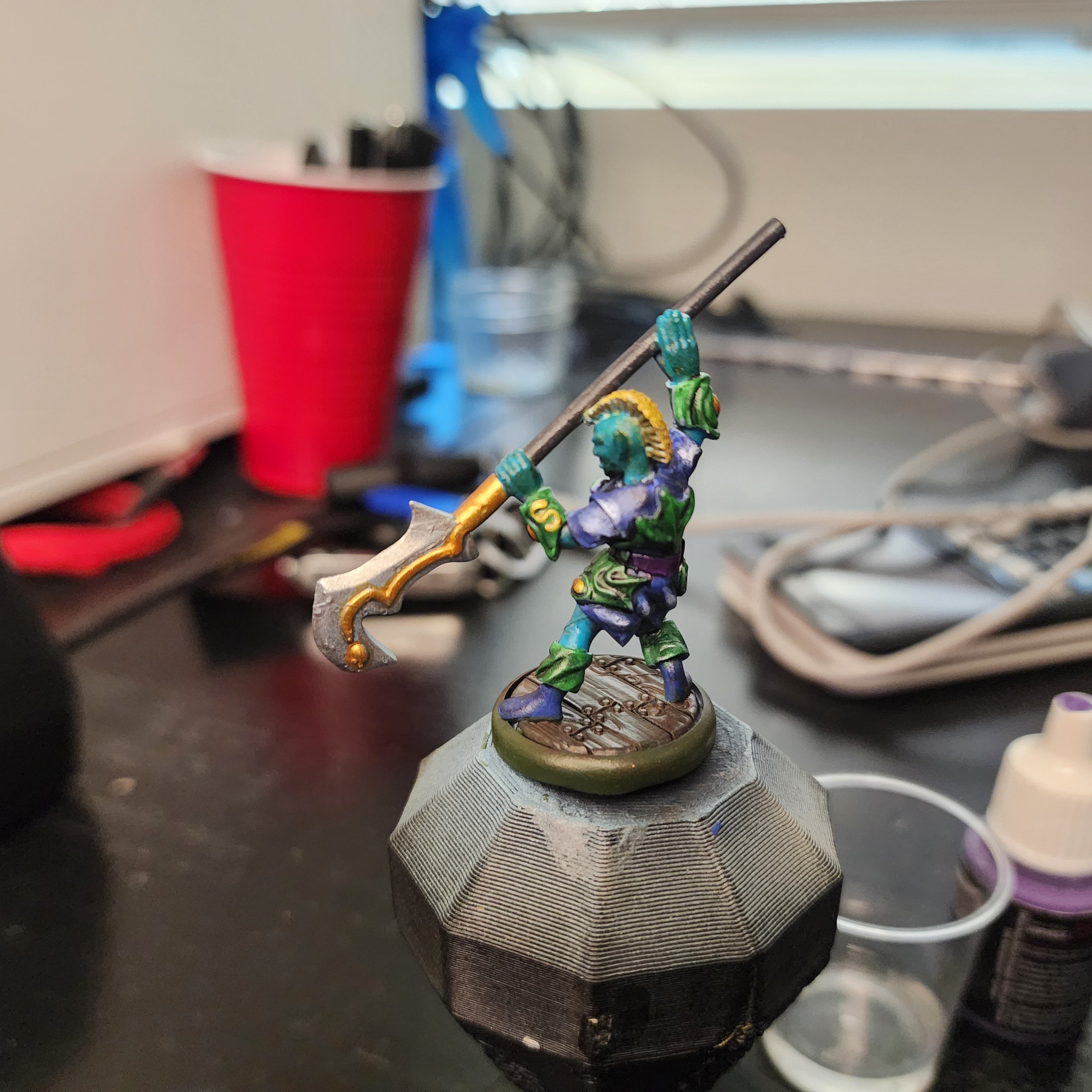
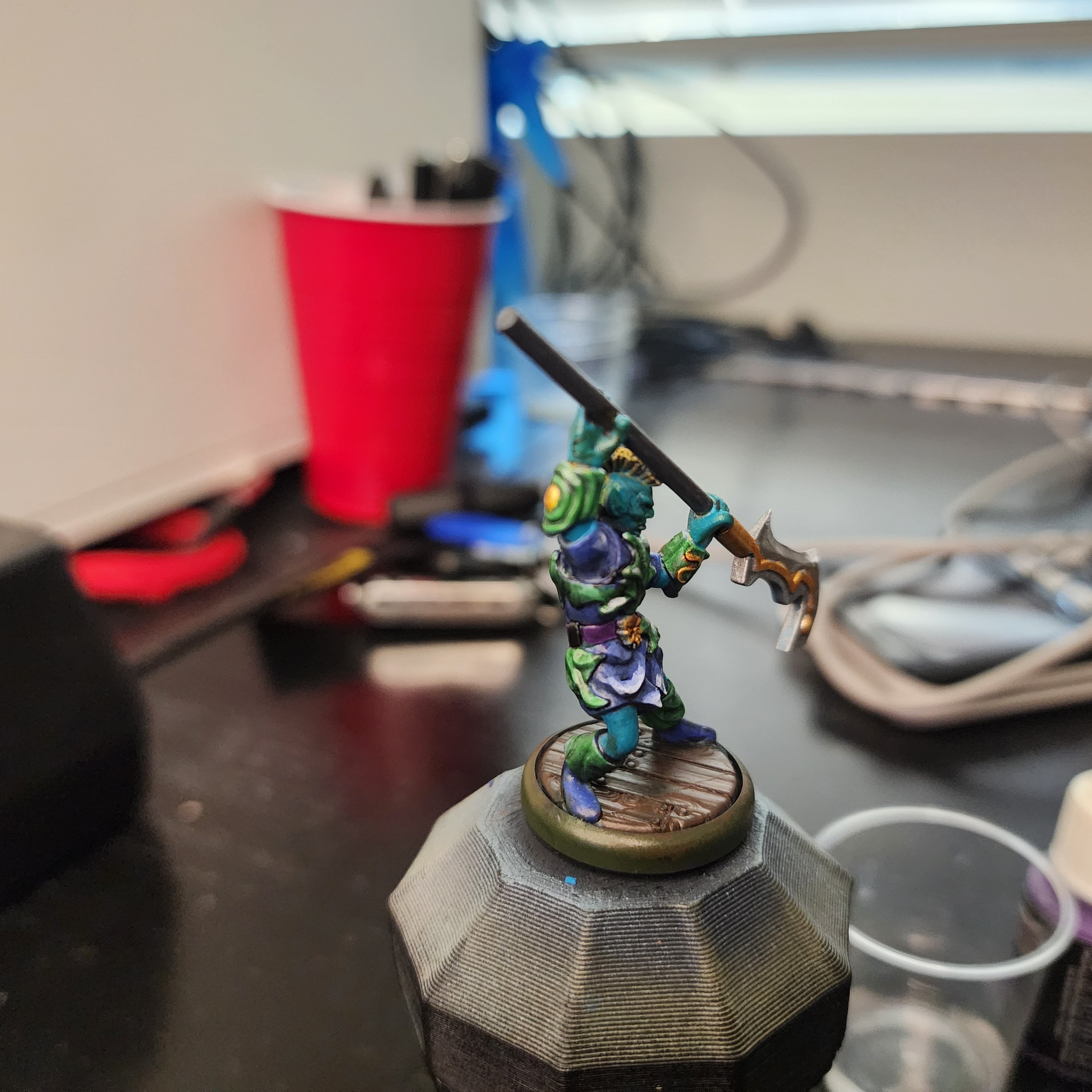
This is one of the characters from Valandar’s second Player Character pack. His weapon made me think of mer-people, so I wanted to paint this guy with an aquatic theme. About halfway through I realized the color scheme wasn’t going in the direction I wanted, so I abandoned the aquatic theme and just picked colors that I thought would look good together.
After applying the final wash, I felt the model looked too dark and monotone, so I decided now was a good time to give edge highlighting a try, something I’ve always been too lazy or impatient to try. Holy crap, does a tiny bit of white make a difference! You can see that my blending and edge selection leaves plenty to be desired, but for a first time, I think some parts of his robe look really cool.
As always, here are a few more angles:


If anyone has any advice or pointers for color selection, I’m all ears. For this guy, I started with the color I knew I wanted to make a bulk of the model (blue/ aquamarine), picked a few nearby colors (green and purple) for the secondary bits, then jumped across the color wheel (yellow and gold) for the highlights. I think the model has good contrast, and the colors look ok together, it just doesn’t have the look I was going for. I’m sure I’ll get a better eye for color selection as I continue to paint, but if there are any places to start looking I’m open to pointers.


Man, thank you so much for this. I’ve learned a ton from your tips. I’m taking a short break from miniature painting to work on some larger pieces, but having the fine detail skill helps to make parts of my larger models pop.
I’m working on a small-mediun Poseidon statue now, and I’m mimicking the color scheme from my “blue skinned half giant” per request. Already I’m enjoying the skin tones much more because I’ve learned a good amount since then.