
After seeing something similar elsewhere I decided to give this a go.
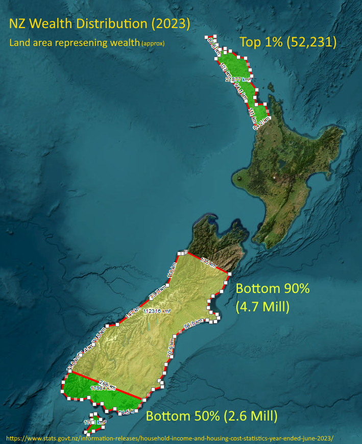
Honestly, I thought the top 1% (population the size of Hastings) might reach down to Whangarei or at most upper-upper Auckland, but it’s the visual representation of the top 10% - basically everything north of about Kaikoura - that shocked me the most!
So you’re attempting to represent percentages of population and their wealth in terms of the land area covered?
If this is so, i don’t understand whats happening at the bottom of North, and Top of South Island.
Are the numbers in the brackets number of people in that section?
Looks like an interesting design, but it needs a little more work to work well as a quick visual understanding of the data being communicated.
That unlabeled middle part must be the top 10% (minus Northland which represents the top 1%).