
How “watery” is this water to you? Enough or do you expect something more from “abstract map-tier water”?
The important thing is, it has a different texture from a land. You can even do this the other way around and it would still be fine.
deleted by creator
I think this looks better than flat blue, but it really depends on the rest of your map. Can’t really see a lot of it here.
And why are there a few short horizontal lines in the left side of it?
deleted by creator
I was going with “nice” until I noticed those waves.
They don’t feel like waves (and probably won’t even with more of them) with the currently added hashing (slanting lines).You might want to change the colour of the waves or something if you want to keep the 2 together, such that they produce the effect you are aiming for.
It really doesn’t matter too much honestly. The important thing, if it matters to the game, is that the effect the water has on gameplay is conveyed.
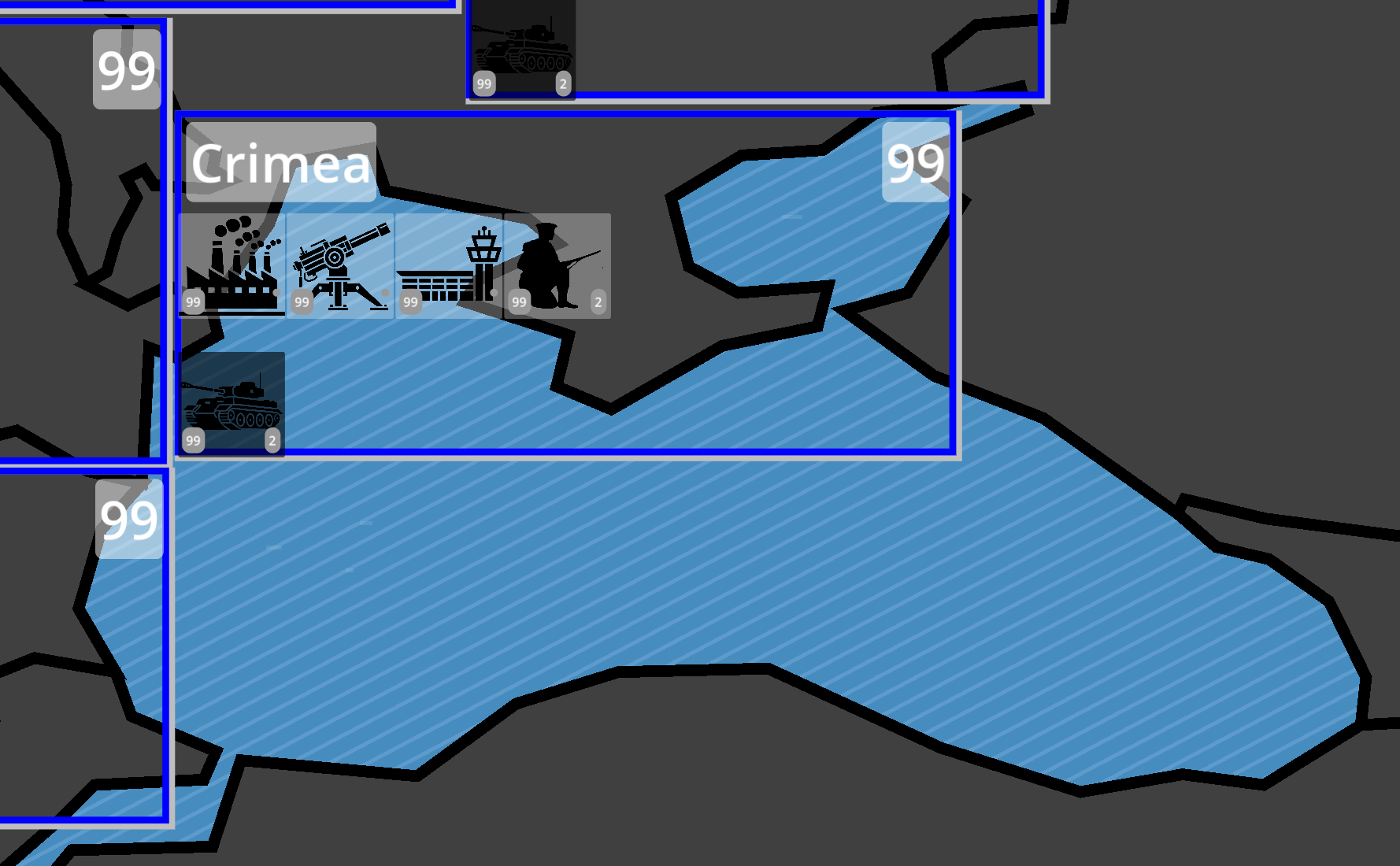
It appears to be a
19th century or world war 1WW2 era war game? For example: If there’s a pathing route for units moving by sea to different areas in thr Black Sea here that should be able to shown without being obscured by the color/texture. So if there’s a supply/shipping route from Istanbul to Svestapol, however that is shown should be visually clear.Another possibility for general vibe artistically would be to look at period specific maps. A
19th20th century looking map overlaid on a parchment texture can sometimes work for a game wholesale. At the very least there are specific and standardized map functions and symbols used to depict features you can always refer to. Topographic and physical maps can provide a lot of reference points for this stuff.*edit saw the tank images better, so ww2 and 20th century?
deleted by creator
The dull and boring WW2 era maps are an aesthetic that I have enjoyed in WW2 strategy games, for what is worth.
All I mean by the ‘doesn’t matter’ point is that there is not a high bar for visual effects and that the GUI not be compromised in the process. It appears you’re aware of that already, so don’t get hung up on how it looks too much; dull and boring isn’t necessarily bad in this case.
Looks great with your minimalist map style. Nice work!
I like it.
Looks good. Like conceptualized ripples or waves.

