

Located in London, I measured the RTT or round trip time to 574,691 random webservers and plotted the times on the globe.
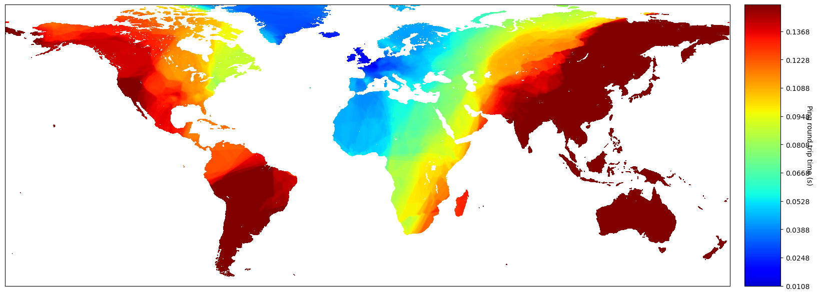
Discovery was done with masscan, measurements using hping and plotting with an old Python script I’ve revived and enhanced.
This is part of the next writeup on my blog, with which I will be posting any of the code I’ve used.
Cool I’m super interested in the result. I’m marking the post!
Edit: I also love the visualizations, didn’t make that clear in first reply 🫣
Hard to get the scaling right but I messed around a bit, here’s RTT / (2 * Distance / c )
Scaling on Europe is fun too
So this looks like the closer the server, the less efficient (more convoluted) the path to it is. Very cool.
I’m thinking its harder to get sub 15ms consistently maybe? Brussels, Amsterdam, Paris, expected lightspeed times of 1-2ms, in reality you’ll get 10-20ms.
Global internet is optimized for global connectivity, I’m imagining resources are better spent optimizing the 50-200ms range than the 1-10ms.
Super cool plot! Few questions, I was trying to read the scale bar. It says RTT/(1-(2*distance/c)). I guess that’s a typo? otherwise I’m not sure what it would mean.
Then the scaling goes up to 10, did you multiply by 10 or did you inverse the values? (Inverting would mean higher values = lower connectivity? which I guess is possible in Europe if we have to consider the routing ?).
Also it’s very interesting how uniform the whole American continent is.
Ah yeah ofcourse I was experimenting with comparing it with the lightspeed itself, then inverting it with -1 so its coloured correctly. My mistake not changing the label enough.
That is actually the real scale, in Europe we get theoretical speeds of 2-3ms according to the speed of light. Real RTT’s in Amsterdam for example are around 20ms, so you get values >10. The further you go from the EU, the closer to ideal times.
It’s interesting to see the places where connectivity is much better or worse than the surrounding areas.
Alright thanks! so it means you’re showing RTT theoretical/RTT actual? That makes sense!
That was experimenting, the actual graph shown is the other way around, so it shows the real differences, not just compared to lightspeed (ie I forgot to remove the ‘1 -’ from the label)