- cross-posted to:
- hackernews@lemmy.bestiver.se
- cross-posted to:
- hackernews@lemmy.bestiver.se
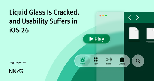
iOS 26’s visual language obscures content instead of letting it take the spotlight. New (but not always better) design patterns replace established conventions.


There’s two things I like about the new UI design,
However, “Liquid Glass” isn’t needed for either of these. Further, the new UI is so inconsistently applied. If an application hasn’t been updated with this new UI, you get a different keyboard for that particular app, and I’ve no idea why that’s the case. It seems completely arbitrary.
The new animations are distracting, some are glitched out (if you tap and hold on a folder, all the icons in it flash), and pretty much none of them serve any purpose. What’s the point of the “glass bubble” that pops up over tab elements when you click them?
Skeuomorphism had a point. The idea was to draw parallels to real life objects, drawing on mental shortcuts to make user-interfaces more intuitive. I don’t believe that anything is truly intuitive, but design and animation applied properly does help on the way. It’s why I like the dialogues expanding out of the buttons you press now, it signals to the user what caused the dialogue to appear, and it means you don’t have to move your finger across the screen. That’s good design.
All this transparency and the superfluous animations though? Could live without it.
Edit: speaking of glitchy animations.