

See crosspost(s) for more discussion:
This is the first big step in the process to develop comprehensive guidelines for the Fedecan non-profit and the various platforms.
While this will mostly involve converting tacit knowledge and experience into an explicit written form, we expect that this process will inevitably bring up some points of disagreement on the best way to deal with different issues. We ask everyone participating in these discussions to please contribute constructively and in good faith. We encourage you to bring up any concerns or issues you have with the proposed structure and drafted guidelines, so that we can work together to fix them early on. However, in order to keep a productive environment for those discussions, we will be pruning any comment chains that devolve into personal attacks, slap fights, etc.
To help ground your feedback, consider these thought experiments when evaluating a potential guideline:
- Veil of ignorance: Would it still feel fair to you if you switched places with someone else on the platform (ex. a new user, a moderator, an admin, a member of a vulnerable group, etc.)?
- Equal Applicability: These rules will be enforced uniformly on everyone. A poorly written rule that helps “your side” today, can easily harm “your side” in the future as circumstances change.
The full guidelines, including governance details like the annual review cycle, can be found on the website: https://fedecan.ca/en/guidelines/
We plan to structure the guidelines as follows:
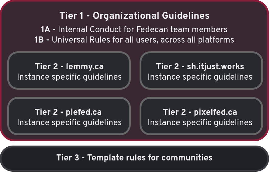
Tier 1: Fedecan Rules
Internal Conduct
These rules apply to Fedecan team members (directors, officers, admins, and anyone with elevated access). They set expectations for how team members should act.
Universal Rules
These are the baseline rules that apply to every user on every Fedecan platform. They cover the things that are prohibited by Canadian law (threats, hate speech, CSAM, non-consensual intimate imagery) as well as universal policy rules (privacy/doxxing, harassment, fraud, content that could cause harm, labelling of sensitive content, etc.).
Tier 2: Platform-Specific
Each platform has different functionality and norms, so this is where we can be more specific with the rules. The threadiverse platforms (lemmy.ca, piefed.ca, sh.itjust.works) share similar rules around community creation, moderation, vote manipulation, and content labelling. Pixelfed has its own rules tailored to its platform.
Tier 3: Community-Level Rule Templates
These are optional templates that communities can link to, or use as a starting point for their own rules. The idea is that moderators can point users to a clearly written explanation of why a rule exists, and any relevant exceptions, rather than trying to fit everything into the sidebar. Additionally, if many communities are enforcing a particular rule in the same way, then users will have an easier time understanding and following them.
The post title standards template has been drafted, and we plan to add more as the need arises. I have a few others that are in the works, but they have some overlap with the other sections, so I thought that it would be better to let people discuss first.
Definitely!
My plan was to have a short version of the rules in the sidebar of each site, with links to the relevant section of the full guidelines when people want to read more. That way the user can skim through the rules that don’t apply to them, and read more for the ones that they are curious about. We could also put the entire rules in the sidebar, but I think that might be overwhelming and result in users not reading them.
Honest input to your thoughts - as a registered/logged-in user, that Lemmy home page infobox is a UI/UX nightmare - it blocks my quick access to the second box below that has my subscribed communities. Upon visiting, I would immediately collapse that top box without ever looking at it; I now have a simple uBlock Origin rule that hides the top infobox on the home page for me automatically. On old.reddit, the list of subscribed things is a dropdown top left so they avoid this UI/UX problem with stacked infoboxes.
Yea that’s a good point. I know the Lemmy devs are working on a new frontend, and it would be nice to be able to customize some of these things.
Have you tried https://photon.lemmy.ca/ ? It is more customizable and it puts the subscriptions and sidebar on different sides
we have a few other frontends: https://fedecan.ca/en/guide/threadiverse/alternative-uis
(just talking shop) I’ve poked at them, you’d think the old.lemmy.ca would be appealing but not for me - I rather like this Lemmy webUI overall as a design. Good font sizes, line spacing and so forth - it has a well formed comfortable feel which I can tell has an experienced eye to it (minor details matter). Conversely, when I look at, say piefed or old.lemmy I just got “ugh, those fonts! that line spacing!”. The default UI is actually a well crafted piece of usability kit - the infobox is an Achilles heel.
Random: I’ve used the Lemmy webUI details to craft similar feeling looks to HackerNews and (old) Reddit using nothing more than uBlock filters. Nothing grandiose but the fine tuning makes them sorta feel like the Lemmy UI (but worse, holy cow is there so much hard coded HTML in these old sites - lipstick on a pig but it helps).