Hi all! New release. Let’s get into it.
Versions!
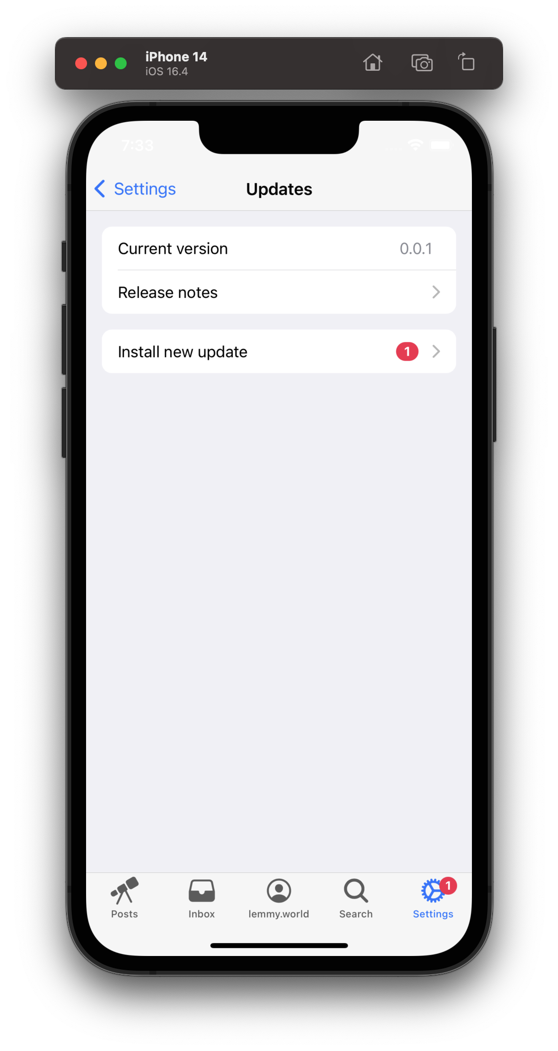
And it’s well overdue. This is version 0.2.0, and assuming you have at least 0.1.4, you can check in settings to confirm your version and get updates! It’s a much nicer experience then “please close and reopen the app and cross fingers”


Lemmy community links
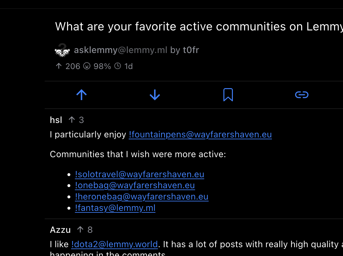
I have no idea what they’re called… but those handles that start with a exclamation mark? They now link inside the app! It’s much easier to subscribe to a community someone mentions.
Note: This is just for the format with an exclamation mark! There will be more work on internal app deep linking for posts, comments, etc.
Try it out! If you have v0.2.0, this should be tappable: !linuxmemes@lemmy.world
Share your favorite communities below! (I want to subscribe, lol)

Swipe right to collapse a comment thread
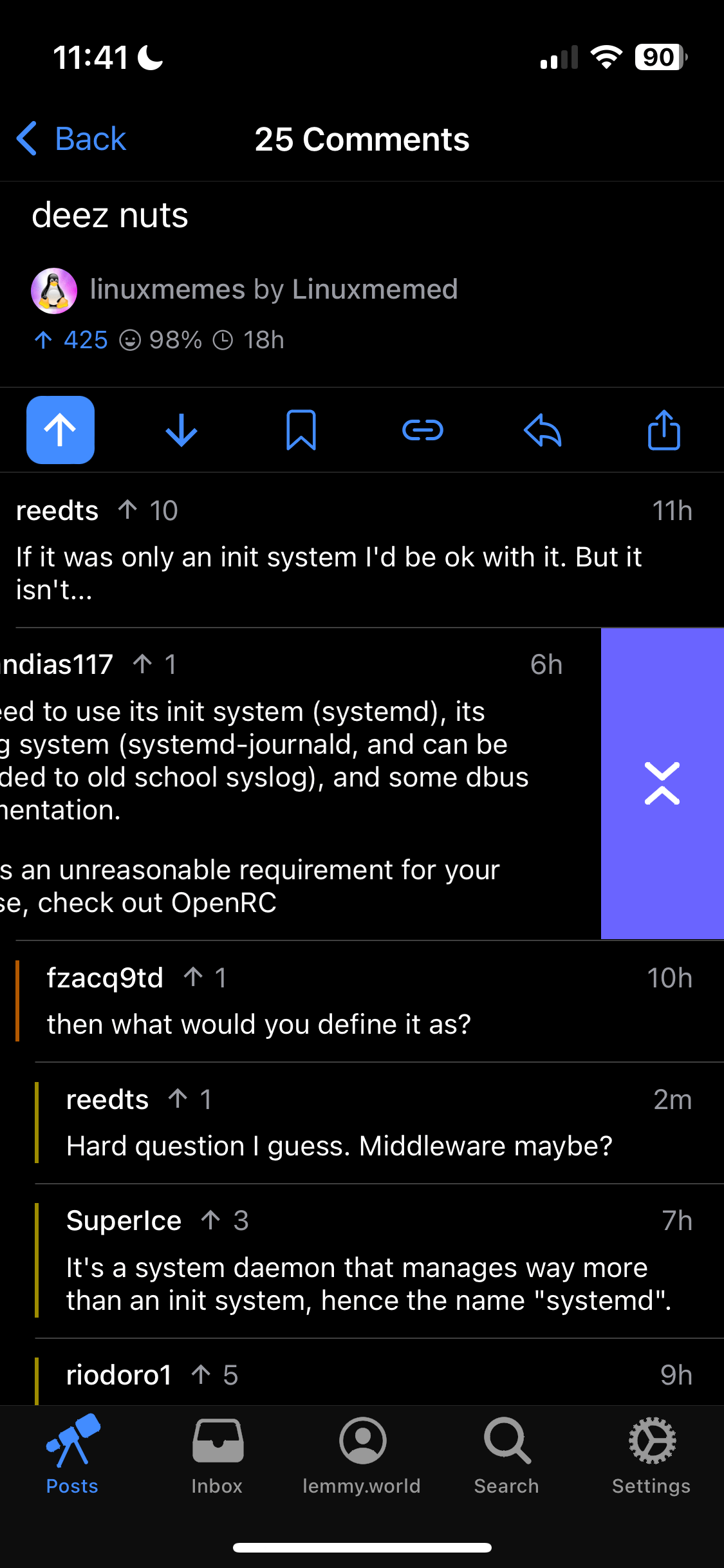
Just like Apollo, you can now swipe right to collapse! And swipe a bit further to reply, just like before.
In the future, these gestures will be customizable!

TONS of bugfixes
There have been a ton of little, but super annoying things fixed along the way.
What’s next
Posts (it would be nice to post these updated from wefwef…) Comment editing. And more bugfixes, of course!
This thing is incredible. I have requests and whatever but honestly, I’m just amazed at how good it is.
Great update! Are there any plans for a compact view for posts?
Yes, after some other core features (new post, edit comments)
It’s coming though :)
Awesome. Great work on it, never had a web app feel so native.
This is an amazing PWA!! Honestly feels just like an app and coming from Apollo feels just like it!
Thanks for building this and sharing with the community!
Incredibly good!
One thing still is missing though: jumping to the top when tapping on the tap of the screen. Is that possible in a PWA?
Not currently (in Ionic) from what I’ve found (never say never), but there is a workaround. Tap the posts tab button in the footer and it’ll bring you to the top.
It’s annoying, but once you get used to it not too bad. :)
That‘s good enough for me at the moment. Thanks for the reply. That trick even works in the subscription list!
Don’t know why but when I hit the reply button on this thread I just get a black screen.
Also when I use the exclamation mark I don’t get the drop-down to choose the community? I gave to type it out fully myself? So like !drumandbass@lemmy.world
d’oh! Thanks for reporting. 0.2.2 should have the fix.
Thanks! You’re on a roll :)
I just discovered wefwef and I just want to say thank you. It’s amazing. And it’s incredible how you’re single-handedly improving it so quickly as well. My muscle memory from years of using Apollo isn’t going to go to waste after all!
How would you prefer accept bug reports and suggestions? There are some minor issues that I’ve noticed. For example, when replying to a large comment/post (like this one by you) the space for typing gets congested and if I try to scroll up my own comment, the whole dialog attempts to close. My workaround is to drag the cursor instead.
Hi there! Glad to hear you’re liking it. :)
You can make new issues here: https://github.com/aeharding/wefwef/issues
And if you’re not sure if it’s a bug, and just want to discuss further, I recommend Discussions: https://github.com/aeharding/wefwef/discussions
Thank you!
The update process was great!
You can actually see in your screenshots, but the time and battery indicator text is in white whether the device is in dark or light mode. In light mode, the text should be black.
I might just be missing it but is there a way to change the text size across the app? If not is that on the list of features to add?
My aging eyes are struggling with small typE these days.
Great work. Really impressive.
Not currently. It’s a priority though. Within a week, likely!
That will be really welcomed. At least by me!
You have written a really good app. Even more impressive that it is a web app.
I saw someone else ask about hiding read posts. I would love a button that allows you to toggle hidden read posts on and off on the main timeline. It’s another thing Apollo did really well that I haven’t seen any Lemmy app do so far.
Many thanks for “swipe right (left?) to collapse a comment thread!” Just wanted to report that it does not collapse the whole comment thread now, only a current comment I swipe on.
Hmm, it should collapse all children. Not siblings though.
Ah, I see. I expected it to collapse all: children, siblings and parents—the whole comment thread—including the root (top level) comment, the way Apollo did.
OH! You’re totally right. I should implement that.
Yaaaay!
Fixed in 0.5.0! Let me know what you think.
Yea that’s way better now! Tap to collapse a comment+children, swipe to collapse the whole chain from any child comment.
Epic.
Wefwef is fucking great already! Thanks for all your work!


