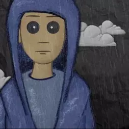

It looks absolutely amazing
So cute!
Same one I switched to, its so cute. I wanna see more art from the artist
You had to switch to it? For me it was there the moment I updated. Maybe because I didn’t have another alternative one selected.
Oh i switched to it a while ago i didnt realize its the default now
Ah so it might have been around for a long time and I just didn’t realize it
It was added in 1.1, but it was made the default in the latest TestFlight :)
Do we think it’s holding its hands up or are those ears? I vote hands because that makes it look excited.
Big improvement! Much cuter imo
deleted by creator
Yeah I’m on original icon gang too 😅
You won’t find a single app icon in this world that everyone agrees with and that’s totally fine. It’s okay to have different opinions, and in Mlem there’s enough icons to choose from.
Thats what makes a Subaru,
a Subaru
Switched to this icon the moment it dropped. My personal favorite out of the fine selection.
Looks like MegaMan
It’s nice that there’s community engagement now, but the Mlem “character” should be somewhat consistent between iterations. Apollo community icons kept it pretty consistent. This is a big departure in the design.
It is a pretty well-made icon, tho
There are a few reasons we switched, but the largest by far was the fact that artist who made our old logo just vanished and didn’t leave us the original files for that logo, so iterating on it would first require a total reconstruction of those files. This one is made by one of our core contributors, Sjmarf, and we have the original files so we can adapt it and iterate on it even if he leaves the team.
I suppose that makes sense from a technical standpoint, and I understand where you’re coming from, but what I said about staying close to the Mlem character remains true. It’s a sticky situation.
While a well-rendered character and well-made icon, this new character isn’t very “Mlem”. It’s adorable, and it looks great, but there’s something missing in a visual link to this community. That’s all I’m saying.


