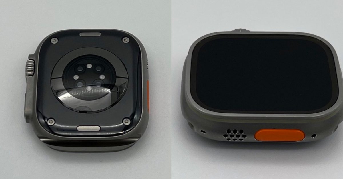
as always fingers crossed Apple leverages whatever R&D they had to sink into this new ceramic to launch new Ceramic Editions! my ceramic s5 is so slow and so dim and the screen feels so cramped compared to my s7 😭😭
Still this ugly orange button
I like it. It’s not super obvious when you’re wearing it anyhow. I often even forget it’s orange.
Change that hideous orange button and we have a winner
And not make it the size of Jupiter
I like the orange button, at least with the current watch color. I think it goes with the aesthetic of the Ultra and the way Apple marketed the Ultra as a more rugged, more advanced watch for outdoorsy people.
It’s not a subtle choice, but I think that was the point.
Maybe they could tone it down and make it a colored ring around the action button, similar to the way the cellular watches used to have a solid color on the Digital Crown that was changed to a color ring later.
It still amazed me that people pay twice as much for practically the same watch. They’ll both antiquate and lose battery life at the same rate. The premium features seem intended for extreme outdoor activities and many of the guys I see wear them are out-of-shape indoor guys.
The screen on the Ultra is miles better than the aluminum. Stainless steel is $699 so the Ultra really isn’t that much more.
100%. Literally every person I know who has one is not apart of the target audience. And they paid $800+ just for clout.
Still praying for a slightly smaller ultra 🙏
Orange button is cool
If this happens I’ll upgrade from my S7 but otherwise I’m staying till a big upgrade. The upgrades have been so small for years.
I’m always team silver though.
I’m still holding out for a round watch lol
Hopefully for the Series 10, they’ll release the Apple Watch X, and it’ll be round.
I hope so!
That gonna look like shit when it gets scratched
Tbh as somebody who really wanted a black version, I’m not stoked for it if it looks like that. Looks more like a dark grey than black
It’s a photo… so hopefully it looks better in person.
Sorry, but that’s not black enough for me, anyway!
Just give me an ultra without the ugly orange! Black preferably, but anything neutral.
I went for the ultra this year, hoping for this black color but no go.
I love the size of the ultra, I just wish WatchOS would utilize the whole screen. It’s like the regular watch with a bunch of empty / unutilized space around it.
I’m genuinely curious (I just tried to check) where you’re getting this impression. I’ve had an Ultra (first gen) since launch and I never noticed that. Everything seems to take up the full screen, even if it’s just a bigger version of what is displayed on the regular Apple Watch.


