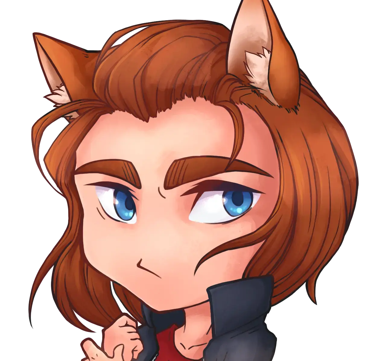
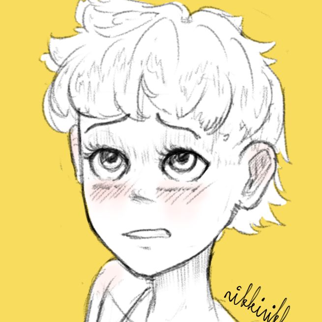
Nice self-portrait!
(This is my non-artist opinion - I don’t know shit) The style and detail has improved a lot but I feel like the biggest improvement is that the self-portrait is more dynamic compared the old one - I think it gives it more life.
That’s some fantastic improvement in less than a year, great work! Your varying line weight is well done on this portrait. 👏
I gotta find some sort of reason to experiment with more sharp and angular shapes at some point. It makes for a neat look and stylized look, but it’s a bit outside my typical form. It would make for a good prompt to draw something a little different than usual, though. I’ll try and keep that in mind the next time I’m struck with the inspiration to draw something that’s otherwise without a plan 🤔.
This is awesome. I like the style you’ve developed, it goes well with your actual picture
Keep at it
Awesome style! With some bright colours I can see your art really pop.


