Some quick unrefined feedback (my remarks, no bad ill intended):
UX:
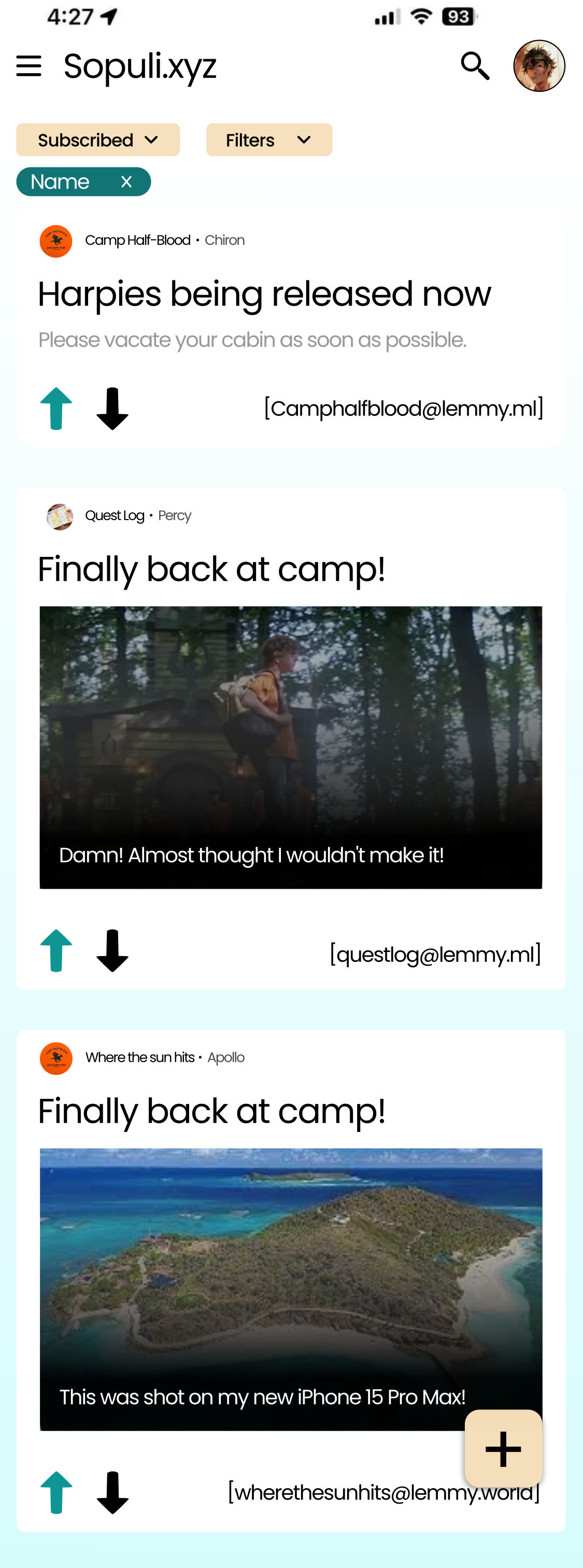
It takes up a lot screen real estate without giving much info back:
Each posts displays: Title, username, communityname (twice), communityinstance, embed preview or post body, What Jerboa now displays as info in card layout: Community(icon/name/instance), User (name, icon, bot, mod), Total score, (up/down)votes, post title, post body/ post preview, time posted/edited, read/unread, pinned, deleted, featured, saved, already (upvoted/downvoted), total comments and new comments
Community name and username are bit too small, hard to read, makes touch targets very small thus hard to hit
Title fontsize too big, long titles will reap havoc (And believe me they can get long, especially the mastodons federated posts as it includes a link each time)
No user actions buttons,
to reiterate, takes up lots of precious screen real estate. (It’s why current doesn’t have padding between posts, only when needed). It’s tough to balance: giving loads of information in easy to digest format. Its why currently it uses lots of assumptions, lack of some information can give you more, (ex: doesn’t show upvotes/downvotes if it are all upvotes, community instance not included if its your home instance )
UI:
Don’t like the upvote downvote , too big
Interesting filter prototype at the top there? This scrolls with the feed I assume, so once you scrolled a bit and you want to change the filter you have to scroll all the way up again? And if it popups like the topbar, then it would take up more than 10% of your screen each time
UI/UX Design is hard, definitely what I struggle the most with while contributing to Jerboa. UI wise you can’t please everyone ,ppl have preferences. (The real reason why full search + filters isn’t implemented yet, haven’t had the time yet to prototype it, which is the biggest time sink, the actually functionality is rather simple)

Some quick unrefined feedback (my remarks, no bad ill intended):
UX:
UI:
Interesting filter prototype at the top there? This scrolls with the feed I assume, so once you scrolled a bit and you want to change the filter you have to scroll all the way up again? And if it popups like the topbar, then it would take up more than 10% of your screen each time
UI/UX Design is hard, definitely what I struggle the most with while contributing to Jerboa. UI wise you can’t please everyone ,ppl have preferences. (The real reason why full search + filters isn’t implemented yet, haven’t had the time yet to prototype it, which is the biggest time sink, the actually functionality is rather simple)
I agree with all points, thanks for writting them down. Current UI is great for me.