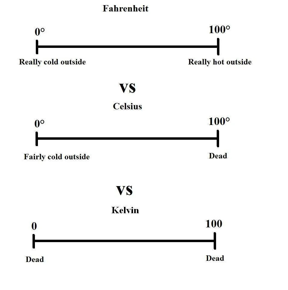
Point of order, the Celsius chart also has a line.
Without a scale on the axis it’s kinda necessary with both so I’m not sure that conveyed your point too well.
Celsius is good because of how it fits with the rest of metric and the units stay pretty rather often, and because everyone else uses it.
That it makes water freeze at zero is kinda the smaller bit. As you mention, charts can just have lines on them because you can’t see the axis and it’s really not that hard to remember 32 vs 0. Hell, I remember both. Also 100, 212 and 451. Had to lookup 233 though, I don’t remember that one.
My point here is that both graphs have a line at freezing (°F and °C). My point is that freezing is a useful differentiation when it comes to weather. Celcius is suitably set to have freezing at zero, a nice round number, which then is negative when water starts to freeze.
It’s not that hard to remember, sure, and both systems work okay, but I dislike when people pretend there aren’t objective (however slight) advantages to Celcius for every day use.
I’d challenge anyone to find a benefit to Fahrenheit that isn’t subjective, for every day use. (Because as noted, Celcius obviously wipes the floor with Fahrenheit in scientific use)
I feel people are clutching at straws trying to justify why Fahrenheit is “better”, or even “as good” for everyday use. But heck, they should just live with the fact they just like it, and that’s fine. (Just keep it to themselves because they’ll get weirdos like me on the internet who will tell them they’re wrong).