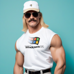
Look at how they massacred my boy…
Your username is a god damn lie, please fix it
Sorry!
Retroenshittified
Brand new word (well not actually, I read it before in another similar post, but you know what I mean).
That’s not nearly shitty enough. It’s too useful. Look at all the options and other clickable things you got on the start menu, and it only took one click to open it.
That’s not how this works anymore. If this were truly made today, it would be needlessly “streamlined”, i.e. everything is hidden so as not to “clutter up” the UI with useful things, and make more room for…nothing. Just wasted space.
We hide everything behind multiple clicks now because the “average user” starts bleeding out their eyes if they’re forced to see many things at once.
Also, icons. The icons in Windows XP are too recognizable. You need to minimalize them. In fact, minimalize it so hard that not one person could understand what the icon is even referring to.
Abstract art icons.
Folder: rectangle on its side. Start: triangle pointing up. Trash: rectangle standing up.
You could have shorted your comment. Now if you’ll excuse me I have to deal with this eye bleed.
Trending Web searches: Janet Jackson
lol
Whatever happened to her? I can’t even remember the last time I heard anything about Janet Jackson.
“Turn off computer” requiring admin privilege escalation is a clever touch.
Actually it’s even more realism, when the shield is on the power button it indicates pending updates.
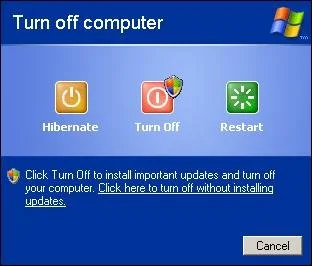
OOP knows their stuff!
Wow… that’s really intricate and sure is attention to realism to a level I didn’t realize.
Also the more or less hidden “click here to power off without installing updates” shows how little Microsoft has changed.
That option was actually fully removed in 8 I believe, then restored in 11 (and newer versions of 10 iirc?) because everyone hated it so much lol
Also I think it was Vista that replaced the flag shield on the power button with a yellow exclamation mark shield instead to differentiate it from the new UAC which used the flag shield logo
edit: images bc i love this stuff lol

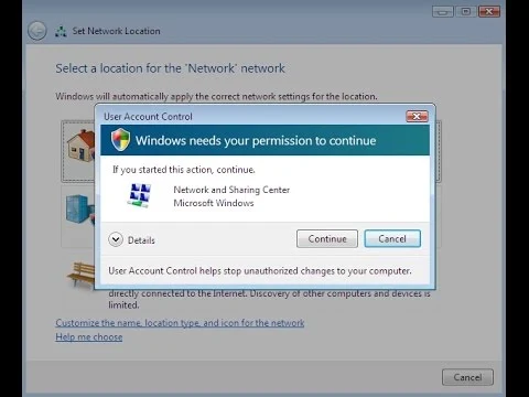
Oh yeah, I had forgotten that too. UAC with separate elevated tokens and Session 0 isolation didn’t even exist until Vista/2008.
I mean, Windows 98’s “Active Desktop” was pretty much this.
Someone at Microsoft has been trying to make MSN a thing for almost thirty years, and they’re sure that if they ram it down out throats just one more time we’ll finally accept it.
Except you Active Desktop wasn’t on by default and was easily turned off in even the cheapest version of the OS.
day ruined
It’s missing the Clippy button in the taskbar
Also missing the handy celebrity gossip, weather and irrelevant stonks shit that pops up every time you mouse past it in the Taskbar.
Clippy search field on the taskbar.
Clippy, now powered by chatgpt
Somehow this still looks better than W11
It’s the full start menu with one click, and the toolbar isn’t needlessly centered, so yeah. I’d actually take this over Win11
You can set the taskbar stuff to stay on the left, at least in the version of win11 I use for work.
That [Yes] [Remind Me Later] thing is so 2007…
Nowadays Windows features all have a definitive [Off] option, that will fully hide the feature from view and only enable a daily message that pops under your mouse so you can turn it back on any time you want.
Where the crypto and AI bloat?
We need AI Clippy.
yea, where are pinned apps in the task bar?
Microsoft is a tool bar maker.
couldn’t be, the login is a local account rather than an MSN
Honestly if Microsoft reintroduces the skeuomorphic UI I’ll tolerate any bullshit they pull. It’s just objectively pretty IMO.
Also this start menu doesn’t have nearly enough useless negative space. Here is my work Win11 start menu for comparison:
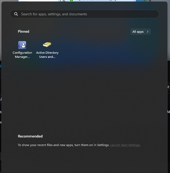
How can it be objectively pretty in your opinion?
Sounds highly subjective to me.
For the record I think it’s ugly.
I was being hyperbolic lol. I just like it.
Unrelated but can Microsoft please update the old rsat tools.
Yes the app “users and computers” work but it could have been so much better if it had a few adjustments like a search bar.
When editing GPOs why the hell can’t I just change an existing setting without opening the editor and digging through the whole damn tree first.
Shame the MS never will improve these tools because on prem is not the cloud.
DVDs nuts
ha! got em
WinXP was good
Yes. The meme makes me nostalgic about the excitement Win XP brought.


