
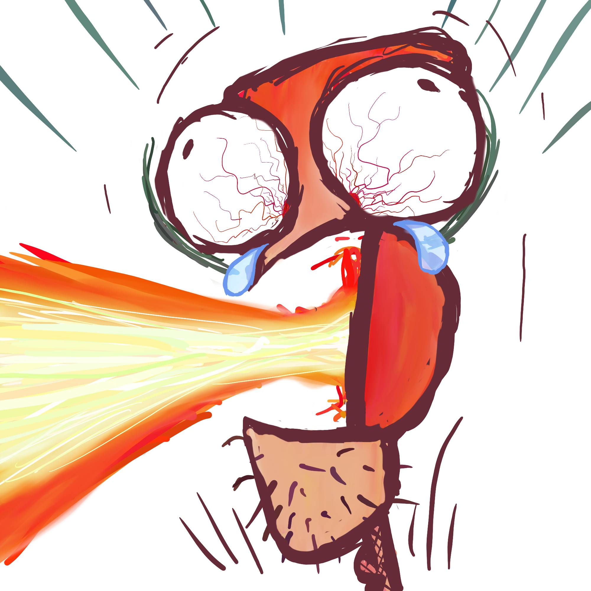
I’m trying to do something a little more stylized. Please provide criticism!
You must log in or # to comment.
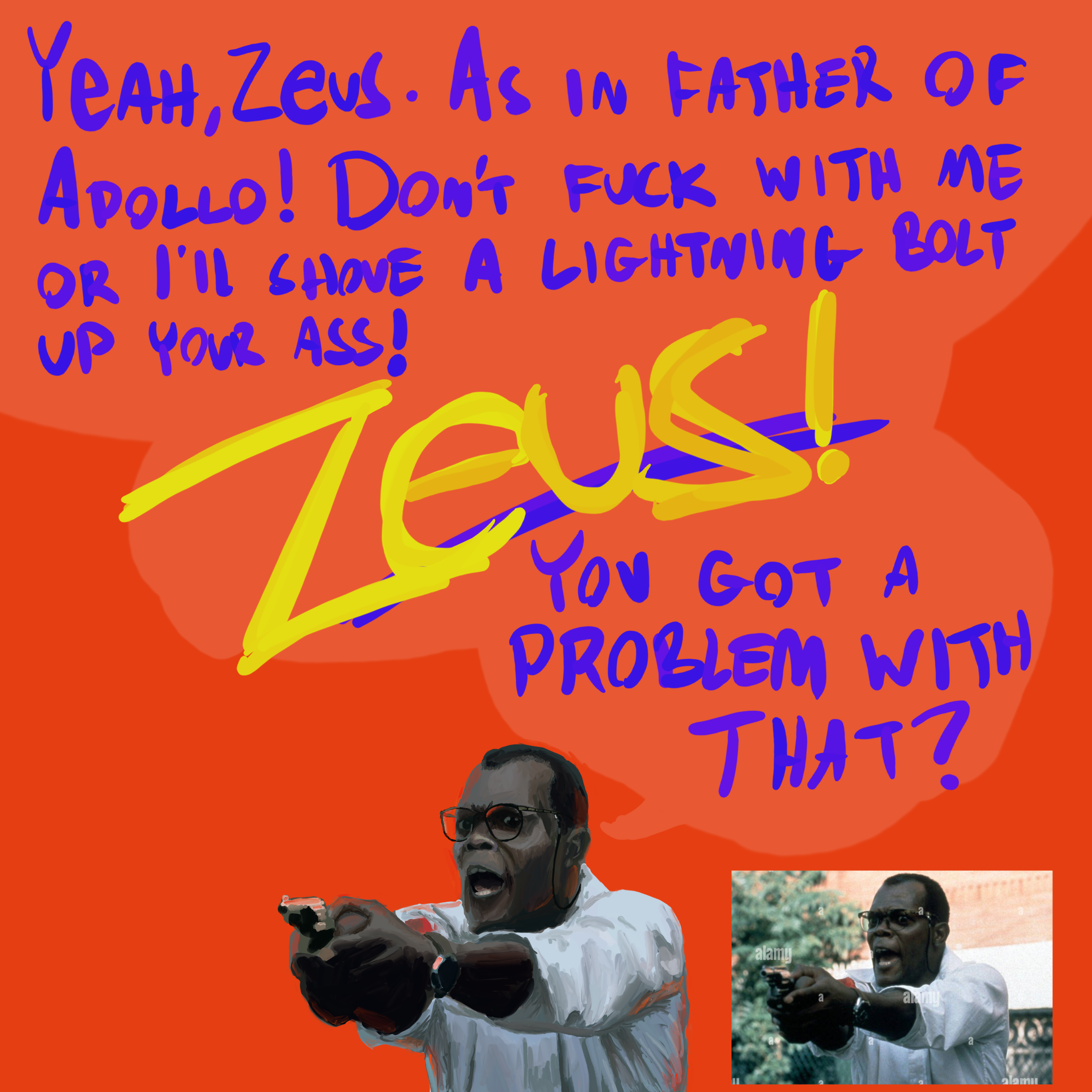
Die Hard 3 was great!
Just rewatched it, classic!
This art looks fucking fantastic. The only criticism I can provide is the lettering, especially the letter S in “shove” looking like a letter C
Oh yeah, I should have written more slowly clearly.
Thank you!
Nope. You can write rapidly and maintain your lettering style because it’s unique to you, just ensure to redo the ones that are not legible
Fair enough. I didn’t even see it until you pointed it out. So maybe go slowly there next time 😆
That’s a really good Sam Jack! It’s like you figured out the magic spell that makes him and can do it on command. This one does seem to have more of the energy of the work I saw you do before SJ, so I think that is what you mean by stylized? It’s still a faithful rendition of the original, but it has more of its own personality. His shirt is where I see it the most. Thanks for posting; I hope people with actual artistic skill can give you actual feedback.
Thank you!!