- cross-posted to:
- linux@kbin.social
- cross-posted to:
- linux@kbin.social
Poll on the KDE Discourse to vote between the finalists, the three most voted options will be passed on to the Plasma developers for their consideration. The poll will last for one week.
https://discuss.kde.org/t/plasma-6-logo-final-selection-and-poll/8001
Edit: the image in the link embed is just one of the designs, there are 6 different designs
Edit 2: Important as well to note that the results of the poll are non-binding, and serve as suggestions to the developers


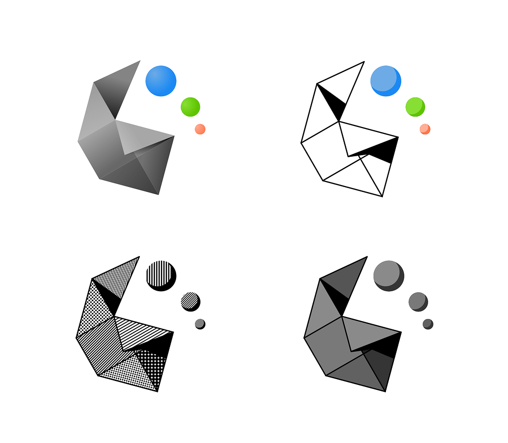
So I’m the only one vibing with the fold?..ight
The fold is one of my faves too. Firstly, it’s not totally flat – Many of the other entries seem a little 2 dimensional for my tastes.
Secondly, the incorporation of the 6 is really well done. It evokes pride in this major release of KDE much like other systems have done in the past with integrating their major versions into the brand imagery, such as Windows from XP to 7.
Some of the other ones like the gear and triangles would be good for, i dunno, the start menu and iconography for KDE in general.