- cross-posted to:
- linux@kbin.social
- cross-posted to:
- linux@kbin.social
Poll on the KDE Discourse to vote between the finalists, the three most voted options will be passed on to the Plasma developers for their consideration. The poll will last for one week.
https://discuss.kde.org/t/plasma-6-logo-final-selection-and-poll/8001
Edit: the image in the link embed is just one of the designs, there are 6 different designs
Edit 2: Important as well to note that the results of the poll are non-binding, and serve as suggestions to the developers
You must log in or # to comment.
I think they should’ve done a community contest like for the wallpaper. But even more I think Plasma (or more in general KDE) should work on brand identity first and then, given the direction, decide a clear, original and distinct logo / wallpaper / whatever style.
@linucs
For me, they did “the cube thing” -again- and i like it. It’s what brought me to linux in the first place: boasting to my friends that i could do this and that, and they couldnt.
Lost a few fights, around compatibility and reach.
But hell yeah do i love that damned cubed desktop come back around: moar kiddos, moar future. And feel more hopeful about the curre t state of open source when the mass discovers it because its kewl.
@NiaTheCat
Please remember the poll is non-binding. The devs are under no obligation of changing the log if non of the proposals live up to their standards. The selected logos are just suggestions for them to consider. Nothing more.
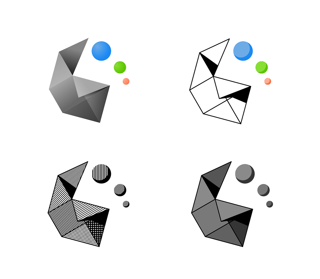
So I’m the only one vibing with the fold?..ight
The fold is one of my faves too. Firstly, it’s not totally flat – Many of the other entries seem a little 2 dimensional for my tastes.
Secondly, the incorporation of the 6 is really well done. It evokes pride in this major release of KDE much like other systems have done in the past with integrating their major versions into the brand imagery, such as Windows from XP to 7.
Some of the other ones like the gear and triangles would be good for, i dunno, the start menu and iconography for KDE in general.
Those triangles look great and are memorable, even at lower resolutions. I’ll even get some swag if that becomes the Plasma brand.
I voted for the “Half Gear” because I always loved that design, but I gotta admit that the Triangles look pretty cool and a bit more modern.
What if we don’t like any of those?
then suffer
(jk this is just a non binding poll to gauge interest)
6 is already coming? It feels like it was only yesterday when 5 was announced. I’m seriously getting old…
Could anyone give a brief rundown of the changes since 4? I really tried to like it but just couldn’t. How’s 5 compared to 4? And is there a preview version of 6 available yet?
Could anyone give a brief rundown of the changes since 4?
The headliners are: 1. Porting everything from qt5 to qt6, 2. Getting Wayland working well enough to be recommended as default
And is there a preview version of 6 available yet?
There’s a beta out already
Thanks, I could check it out on holidays. Functional Wayland would be cool. I’m a bit skeptic on the qt migration (I had almost continuous issues when the qt4 -> qt5 migration was ongoing)
And is there a preview version of 6 available yet?
You can try it on KDE Neon if you want something already packaged up.
info
Thingy and Triangles look great, but the gear could have been made better. I wouldn’t have voted for it anyway, because KDE should stay easy to differentiate from Plasma.
My vote goes to Thingy.
I don’t really dig any of these personally but bottom left looks goood if I had to choose
Got to say I really like the Fold. It’s professional yet cozy
I think I vote the bottom right “thingy”.
But I also like the grey and black fold. (Bottom right).
I don’t like the gear logo.
deleted by creator
I liked the triangle’s presentation better, but to me it’s a toss-up between squares and triangles tbh.
I think committing to the gear because it’s more recognizable today is a mistake though, as in a year after it becomes official, this won’t matter at all.
deleted by creator
Can’t vote as still waiting on my account to be approved :(
Half gear is the only good looking one. The rest look too generic.
Fold is a great logo for the major release and
triangles/gearsquares/gear is great for the general OS branding imo