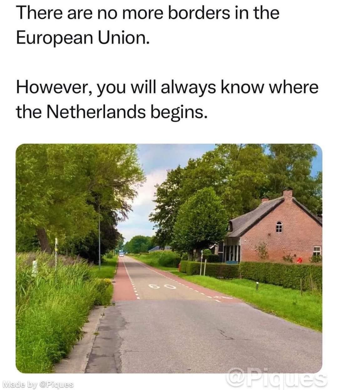
PugJesus@lemmy.world to memes@lemmy.worldEnglish · 2 years agoBorders are merely representations of governancelemmy.worldimagemessage-square48fedilinkarrow-up1727cross-posted to: yurop@lemm.ee
arrow-up1727imageBorders are merely representations of governancelemmy.worldPugJesus@lemmy.world to memes@lemmy.worldEnglish · 2 years agomessage-square48fedilinkcross-posted to: yurop@lemm.ee
minus-squareSomething Burger 🍔@jlai.lulinkfedilinkarrow-up94·2 years agoHere’s a simple chart showing the difference:
minus-squarePugJesus@lemmy.worldOPlinkfedilinkEnglisharrow-up36·edit-22 years agoLeast complex glimpse of European institutions.
minus-squareBarbarian@sh.itjust.workslinkfedilinkarrow-up35·edit-22 years agoDamn, this is really recently updated. Romania and Bulgaria just got into Schengen last month, and they’re already in the right spot on the chart.
minus-squareSomething Burger 🍔@jlai.lulinkfedilinkarrow-up35·2 years agoIt’s from Wikipédia, it gets updated faster than the EU’s website somehow.
minus-squareRolando@lemmy.worldlinkfedilinkarrow-up12·2 years agoI really like this chart. It seems complex, but the upside is that your country can find exactly the level of engagement it wants.
minus-squarejaybone@lemmy.worldlinkfedilinkarrow-up4·2 years agoWow that’s insanely complicated. Also not very color blind friendly. They should put like a two letter country abbreviation below each flag.
minus-squarebitwaba@lemmy.worldlinkfedilinkarrow-up3·2 years agoWhat’s that flag above Ireland that looks like an ice cream sandwich?
minus-squareBastingChemina@slrpnk.netlinkfedilinkarrow-up1·2 years agoCroatia is in the Schengen area on the graph.
minus-squareUnderpantsWeevil@lemmy.worldlinkfedilinkarrow-up1·2 years agoThis is your brain on state sovereignty, folks.


Here’s a simple chart showing the difference:
Least complex glimpse of European institutions.
Damn, this is really recently updated. Romania and Bulgaria just got into Schengen last month, and they’re already in the right spot on the chart.
It’s from Wikipédia, it gets updated faster than the EU’s website somehow.
I really like this chart. It seems complex, but the upside is that your country can find exactly the level of engagement it wants.
Wow that’s insanely complicated. Also not very color blind friendly. They should put like a two letter country abbreviation below each flag.
What’s that flag above Ireland that looks like an ice cream sandwich?
Cyprus!?
deleted by creator
Croatia is in the Schengen area on the graph.
deleted by creator
This is your brain on state sovereignty, folks.