
You must log in or # to comment.
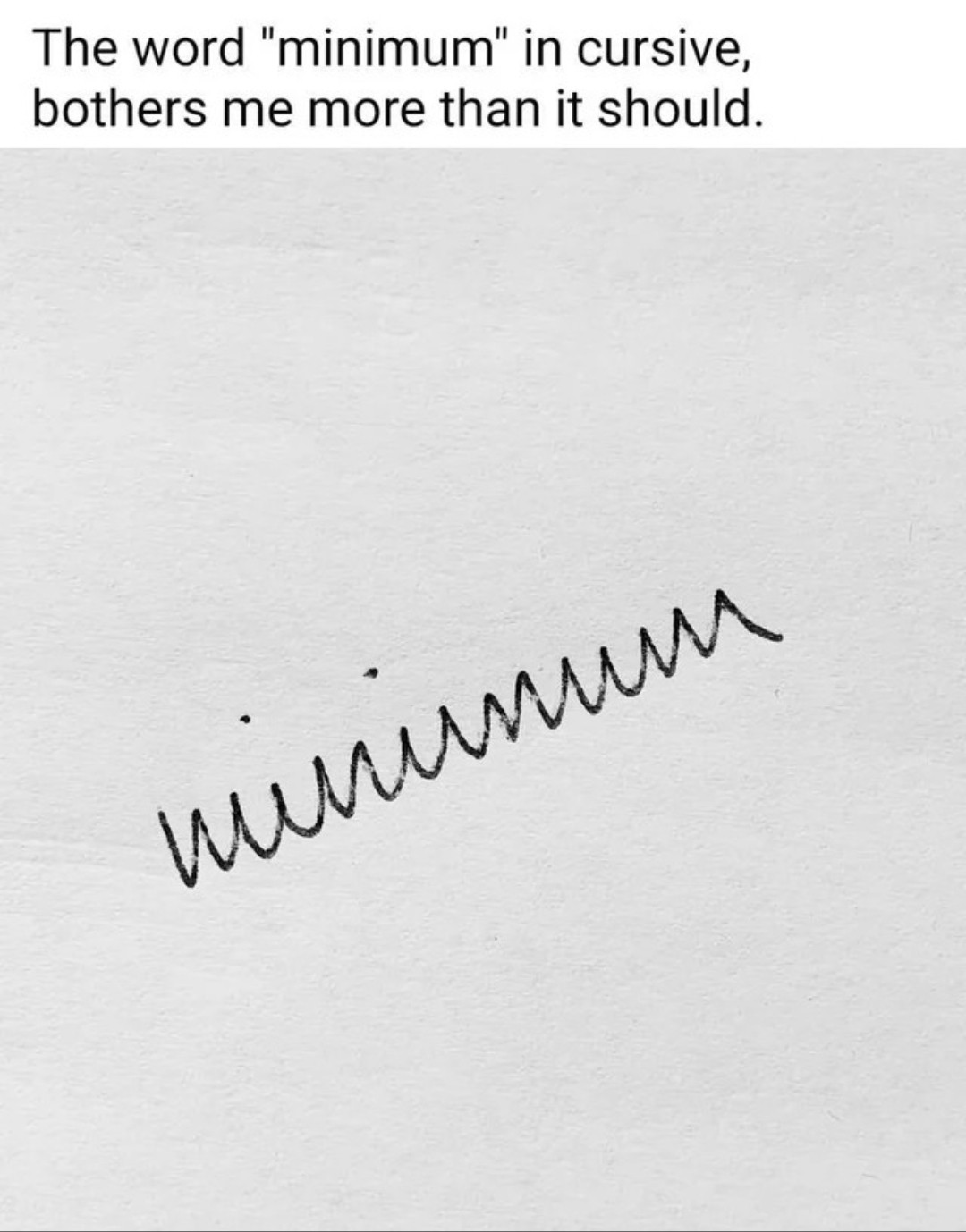
and that’s why we don’t really use cursive anymore
Be greatful you dont write in Cyrillic

This is just an example, there are more letter in the same situation. The most hillarious for me is “T”
My favorite example is from doctors notes, as doctors having unintelligible cursive appears to be a universal constant across the world.
The only cursive there is the couple of ii and the u. And the u is a stretch.

Huh, I’m today learning calligraphy and cursive not synonyms
Though we don’t really use the word cursive in the UK, we just call it handwriting or the slightly awkward “joined-up handwriting” if you need to be specific, though that’s pretty much only with kids learning to write
In german its easier
“schreibschrift” (writefont) = handwritten joined letter where you seldom lift the pen
“Druckschrift” (printfont) = singular letters (handwritten and printed)
“Kallgrafie” (calligraphy)= particularly nice font (mostly reffering to handwritten joined letters
“Kursiv” (cursive) = angled petters like this (engl. Italic)
Calligraphy just kind of means “pretty writing”, it’s not bound to a specific style. Edward Johnston used the term “penmanship” more often. Cursive means that the letters are formed in a “running” way, as opposed to the many times you have to lift the nib in some other styles. Even the romans had a cursive form of the letters we now refer to as “capitals” or “upper case”.
This is how we’ve (myself and the kids in my class, at least) been taught to write cursive, yes - m’s and n’s rounded at the top of the swing, and u’s and w’s with the downward side being rounded. The only acute downward swing I know is in some version of v’s, but I’ve also seen a lot of people rounding their v’s out of inertia a lot of the time.
You can make it much more legible by just curving the parts that are susposed to be curved and not just doing jagged edges everywhere.

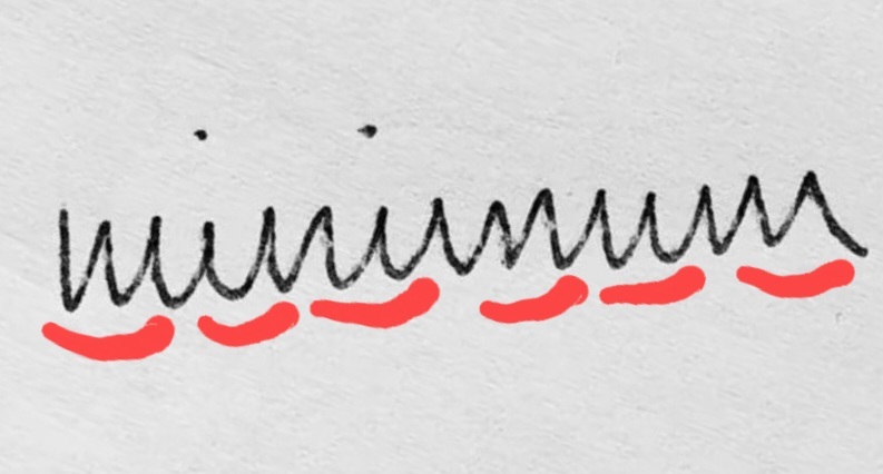
Strictly based on where the jagged points are and where the strokes end, I would say the word written was uůẃnwu.
Looks like vùnunww to me.
Also yeah you got it quite well.


winumwm
deleted by creator
there are many ways to write cursive and differs per country .
I’m not even sure which method I’m taught. There’s “Methode D’haese” and “Karakter” (a modern method).
Yeah you just described the correct and the incorrect way.
You’re ruining the meme
Edit: didn’t think I needed this: /s
Cannot ruin a bad faith argument. I can also write chickenscratch and fast but it still looks more legible than that.

It’s called writing garlands and is a mess for obvious reasons.
Yeah it makes it look like russian cyrilic cursive. That one actually is supposed to have more letters look that way.
Or the Serbian one.
 That is the word for paté. The letters with lines over them sound completely different as well.
Like this

Fortunately, my russian teacher wrote “normally”, while I had to deal with basically this mess in German, where you only could separate the u from the n and the w from the m by the lines below the u and w.
That’s a feature of a very old German hand writing style that hasn’t been used much since WWII
Yet, Sütterlin looks different, as it often has vertical and diagonal straight lines where Latin script has round shapes. But likewise, it’s difficult to read.

Or you go all-in with a mix of Sütterlin and cursive and arrive at the only logical conclusion:

Uuiuicuiuu
mimimimimimi
Sütterlin is cursive? Do you mean mix it with Vereinfachteausgangschrift?
Eh, most likely yes.
More than the misuse, of commas?
Christopher Walken, approves of this, comment.
I never learned cursive, my native tongue uses an entirely different script, so for learning English as a second language, separate letters sufficed. This is what all cursive text looks like to me. I can never read it, even if I try really hard.
Yeah, tends to get like that after speed and comfort start having more weight in the process. Switched to D’Nealian Handwriting (apparently), with more inertial Cursive motions than evident in the example given on the site, because I started having trouble reading my own handwriting once I got into high-school and had to fill up half a damned notebook during Maths and Geography classes…
Interesting list. My handwriting is mostly what’s called “print handwriting” here, but my
aandtare like the D’Nealian ones. And needless to say, my handwriting is not as pretty as any of these.Honestly, doesn’t even have to be… Handwriting is slowly but surely becoming an obsolete means of recording information, most everything’s typed nowadays. Unfortunate (*purely subjective opinion, I enjoy writing by hand A LOT!)
As long as someone else can understand it at first (or second, s’fine!) glance, no need for it to be pretty:D
that’s just a spring.
Mimmimmmm
My ass cannot read cursive to save my life.
That’s because this is terrible cursive and rage bait.
Aluminiumminimumimmunity
How to trigger a British person…
deleted by creator


